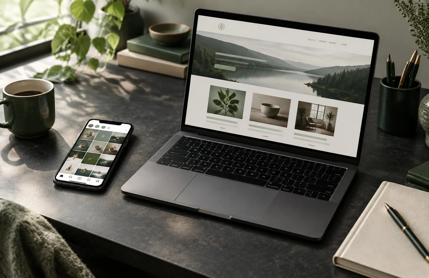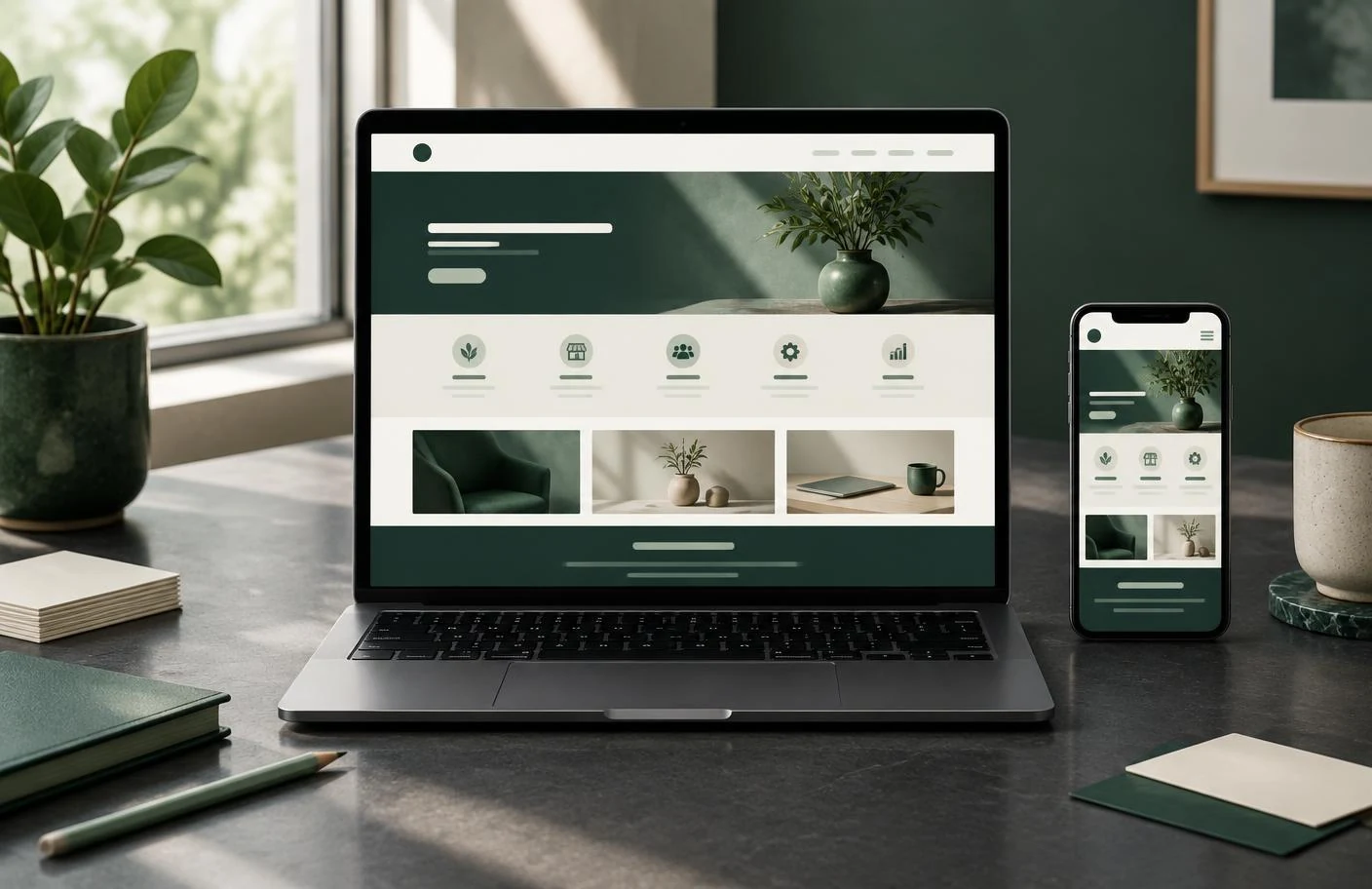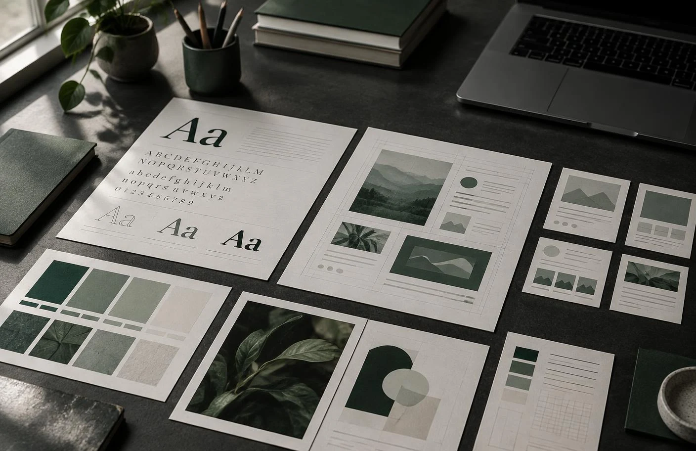
Beauty is part of good design, but it is not the whole job. A website can use attractive colours and impressive photographs while still being difficult to understand. Effective design brings appearance, usability and purpose together.
Visual hierarchy creates direction
Every page contains choices: what should someone notice first, what should they read next and where should they act? Visual hierarchy answers those questions through scale, contrast, position and rhythm.
A strong heading establishes the subject. Supporting copy adds context. Images create meaning rather than decoration. Buttons are visible without competing with every other element. When hierarchy is working, the page feels natural to scan.
Typography shapes the experience
Typography affects more than style. It influences trust, pace and readability. A display typeface may add personality to headings, while a restrained body typeface keeps longer passages comfortable.
Good typography also depends on practical details: sensible line length, enough contrast, consistent sizing and space between paragraphs. These decisions help people absorb information instead of working to decode it.
Spacing gives content room to work
Space is an active design tool. It separates ideas, groups related information and allows important elements to stand out. Crowded pages often feel less professional because every item appears to demand the same attention.
Thoughtful spacing creates calm and confidence. It also improves usability on smaller screens, where tightly packed controls and text can quickly become frustrating.
Consistency builds recognition
A coherent website repeats a considered system: colours, type, button styles, image treatment and layout patterns. Consistency helps visitors learn how the site works and makes the business feel organised.
This does not mean every page should look identical. It means new sections should feel like part of the same visual language. Variation can create interest while the underlying rules keep the brand recognisable.
User experience turns design into action
Design should remove uncertainty. Visitors need to find information, understand options and complete tasks without unnecessary steps. Clear menus, readable forms, logical page order and useful feedback all contribute to the experience.
These details may be less visible than a dramatic image, but they often decide whether someone stays, leaves or makes an enquiry.
Brand identity and business goals belong together
A website is one expression of a wider brand. Its visual choices should reflect how the business wants to be perceived, while its structure should support practical goals such as enquiries, bookings or sales.
The most successful design is not decoration placed on top of a business. It is a clear system that helps people understand the business and feel confident taking the next step. That balance between identity and purpose guides the work at RID ART STUDIO.