A small-business website does not need dozens of pages or complicated effects to work well. The strongest sites usually get a few essential things right: they communicate quickly, respect the visitor’s time and make the next step easy.
01 — Clear First Impression
Visitors form an opinion in seconds. The opening section should make it immediately clear who the business helps, what it offers and why it is relevant. A vague slogan may look polished, but it should not replace useful information.
Use a focused headline, one supporting sentence and a strong visual that reflects the real quality of the business. The goal is not to explain everything at once. It is to give people enough confidence to continue.
02 — Easy Navigation
Navigation should feel predictable. Most small-business websites only need a concise set of links such as About, Services, Work, Pricing and Contact. Labels should use the words customers already understand.
Keep important information within easy reach and avoid hiding essential pages behind clever names. Good navigation is almost invisible: visitors move through the website without needing to think about how it works.
03 — Mobile Experience
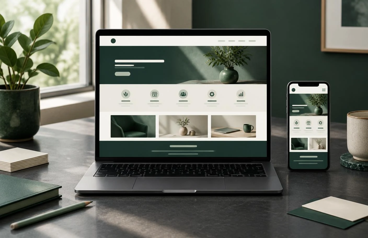
Many customers will first open your website from a phone. Mobile design is not a smaller desktop page; it needs its own careful decisions about spacing, image crops, button sizes and reading order.
Test every important action on a real mobile screen. Contact details should be easy to tap, forms should not feel cramped and text should remain comfortable to read. A site that looks excellent on a laptop but frustrates phone users is leaving opportunities behind.
04 — Strong Calls to Action
Every important page should help visitors understand what to do next. That may be requesting a quote, calling, ordering through WhatsApp, booking an appointment or viewing relevant work.
Use specific language and place actions where they naturally support the content. Too many competing buttons create confusion; one clear primary action and an occasional secondary option are usually enough.
05 — Fast and Useful Content
Speed and content quality work together. Large unoptimised images, unnecessary effects and overloaded pages slow the experience. At the same time, extremely short pages may not answer the questions customers need before making contact.
Use properly sized images, concise writing and a clear hierarchy. Explain the offer, show evidence where available and answer common concerns. Every section should either inform the visitor or help them move forward.
A good small-business website is not measured by how much it contains. It is measured by how easily the right customer can understand the business and take action. RID ART STUDIO approaches each website with those practical foundations in place before adding the visual finish.